Reporting
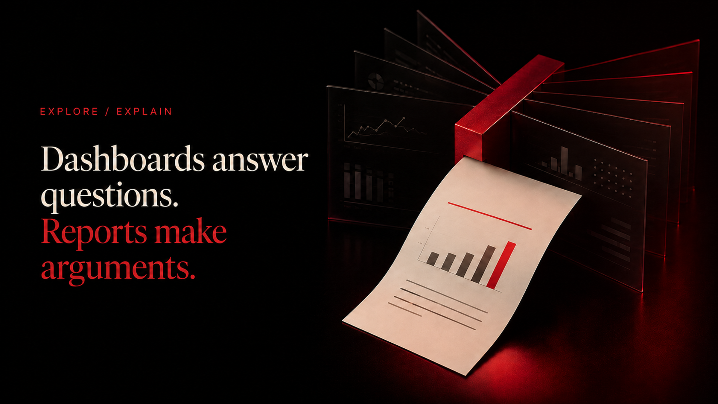
Dashboards answer questions. Reports make arguments.
The industry spent fifteen years building the wrong artefact for most of the people using it.
Every company builds dashboards. Almost every company then discovers, quietly and without ever writing it down, that hardly anybody looks at them after the first month.
The standard explanation is that people are not disciplined enough, or that the dashboard needs to be better, or that adoption requires more training. A new dashboard gets built. The cycle repeats.
The actual explanation is structural. A dashboard is the wrong artefact for most of the people it gets built for, and no amount of polish fixes a category error.
What a dashboard assumes about its reader
A dashboard is a set of charts arranged so someone can look at them. That is a genuinely useful thing, and it carries assumptions that are rarely examined.
It assumes the reader arrives with a question. A dashboard does not tell you what matters this week. It shows you many things and lets you find the one you were looking for, which requires that you were looking for something.
It assumes the reader knows the baselines. Whether four percent is good depends on what it usually is, and the dashboard shows you four percent.
It assumes the reader will notice absence. The most important thing in a week is frequently something that did not happen, and no chart draws attention to a thing that is not there.
For an analyst, all three assumptions hold. They arrive with questions, they know the baselines, and they notice absence professionally. For everybody else, none of them hold, which is why everybody else stops visiting.
The dashboard attrition curve
- high usage
- Week 1high usageNovelty and launch attention
- core users only
- Week 4core users onlyUsually the people who built it
- largely unvisited
- Week 12largely unvisitedAnd a new one gets commissioned
Chapter 17
A report brings the question with it
The defining property of a report is that it arrives. It does not wait for someone to remember it exists.
What a report does differently
A report inverts every one of those assumptions, which is why it works for the audience a dashboard fails.
- It arrives, so the reader does not have to remember it exists or decide to go and look.
- It selects, so somebody has already decided which of the forty available numbers mattered this week.
- It contextualises, so a figure appears next to what it usually is rather than alone.
- It narrates, so the reader is told what moved and what is worth attention rather than being asked to derive it.
- It concludes, so there is something to act on rather than a set of facts to interpret.
“A dashboard scales because it contains no judgment. That is the same reason nobody reads it.”
Notice that every one of these is an act of judgment applied in advance on behalf of the reader. That is the actual product. A report is not a prettier dashboard, it is a dashboard that somebody has already read for you.
This is also precisely why reports were expensive and dashboards were cheap. Judgment applied every week by a person does not scale, so the industry built the artefact that did not require it and then spent fifteen years wondering about engagement.
What changed
The economics that made dashboards the default have shifted, and this is the genuinely new thing rather than a repackaged opinion.
The expensive parts of a report were always assembly and narration. Assembly could be automated a decade ago and largely was, which is why scheduled dashboard exports exist. Narration could not, because describing what changed and why required a person who understood the business.
That second constraint has loosened substantially. A model reading a data source can identify that a metric moved, decompose which segment drove it, compare against a chosen baseline, and describe it in a company's voice. Not perfectly, and not the causal part, which is why approval gates exist. But the derivable ninety percent is now cheap.
Which means the artefact that always worked better is now the one that also costs less. That is an unusual situation and it is worth acting on rather than waiting for it to become obvious.
When a dashboard is genuinely right
This is not an argument that dashboards are bad, and the distinction matters because using a report where a dashboard belongs is equally wasteful.
Dashboards are correct for exploration. When somebody has a question they cannot fully specify in advance and needs to slice data several ways to find it, a dashboard is the right tool and a report is useless.
They are correct for operational monitoring, where the reader is checking continuously against a known threshold. A support queue view, a system health view, a live campaign pacing view. These are consulted on demand by people who know exactly what they are looking for.
They are correct for analysts, who genuinely do arrive with questions and baselines in mind.
What they are not correct for is the executive who wants to know how the business is doing, the team that needs weekly alignment, or the investor who wants to be kept informed. Those are report shaped needs, and they have been served by dashboards for years because reports were expensive.
How to tell which you need
A quick diagnostic that resolves most cases.
- Does the reader arrive with a specific question, or do they want to be told what mattered? Question means dashboard. Told means report.
- Do they need it continuously, or on a cadence? Continuously means dashboard. Cadence means report.
- Do they know the baselines by heart? Yes means dashboard is workable. No means a report has to supply the context.
- Would you be comfortable if they only ever saw a summary? If yes, it was always a report.
- Has anyone looked at the existing dashboard in the last two weeks? If not, that is your answer regardless of the other four.
Frequently asked questions
Should we delete our dashboards?
No. Keep the ones that get used for exploration and operational monitoring, and be honest about which ones those are. The waste is not in having dashboards, it is in having eleven when three are visited.
Can a report and a dashboard share the same underlying data?
They should. Both should read from the same workspace data sources so that a number quoted in a report and the same number on a dashboard cannot disagree.
Is a scheduled dashboard export the same as a report?
No, and this is the most common half measure. An emailed screenshot of a dashboard has the arrival property but none of the selection, context, or narration, which are the parts that make a report readable.
How many recurring reports should a company have?
Fewer than people expect. One weekly operating recap, one monthly business review, and one external update covers most companies under a few hundred people. Additional ones should earn their place by having a distinct audience and a distinct decision attached.
Build the artefact that matches the reader
The dashboard era was not a mistake. It was a rational response to the fact that judgment could not be automated and charts could.
That constraint has changed, and the artefact that always suited most readers better is now within reach for the same cost. Which means the question is no longer which one you can afford. It is which one the person receiving it actually needs.
For an analyst, keep building dashboards. For everyone else, send them something that has already been read.
Convert one dashboard into a report
Take the dashboard nobody visits and turn it into something that arrives with the answer already selected.
Start a report